Wednesday, April 30, 2008

BLG- Final

 Hey everyone! As you can see, my blog looks a little different than the last time you visited!


I wanted the look of my blog to go with the look of my website, and that dots template just wasn't cutting it. So, through trial and error, I edited the html of the template so it would have a different background and slightly different set-up. I only have a vague knowledge of html, so there's no way I could have done this from scratch. But I knew enough to be able to identify the bits of the pre-made template that I wanted to change, move, or remove. It took me a couple hours, but I'm glad I did and I think that it turned out pretty well! Let me know what you think!

Tuesday, April 15, 2008

PYL- In Progress

Hey everyone. Welcome to part two of my blogging for our polymer plate printing project. Try saying THAT five times fast!


Since my last blog, I've narrowed my concept down to two options.
I found some good reference pictures for each concept online, so I put those into illustrator and then started working on the text. I went through so many versions of the text for each option. I must have tried a dozen type faces for each. But in both cases, I eventually went back to one of the first typefaces I tried. 

Option 1- A satire of the word "well-made", by using an image of the Lean Tower of Pisa. 
I ended up choosing Helvetica. I initially only tried this typeface as a placeholder until I chose another one, but it ended up sticking. During class today, Ange suggested using a more "italian" typeface that corresponded better with the image of the Leaning Tower. I agreed, and tried and tried to find one that would work, but none of the typefaces I tried out seemed to work as well as the original Helvetica. Either the X-height was too short, or they were fussy, or they didn't line up right, or I could find some other reason not to use them. None of the typefaces could compare to the POP that I feel the helvetica has. They all fading away instead of having the impact I wanted. So I stuck with Helvetica.

Option 2- Using text as image by showing the words being crushed under an anvil. 
I originally didn't have this concept in my top two, but while google-image surfing I found a really sweet image of a really old anvil, and the concept went from there. I wanted to create the illusion of three dimensions, so I made the text look like a cube. After experimenting with lots of typefaces, I went with Bauhaus because it looked the most solid, and "well-made", and it is historically from the same time period as the anvil itself. Perfect! 

Take a look and let me know what you think please! Por favor! S'il vous plait!

PYL- Concept

Hey y'all! So as my fellow classmates all know, right now we're in the process of creating, refining and doing the technical set-up for our polymer printing plates. We each get two 4x6 prints, and two colors for printing. We were also each given a pre-fix for the word "Made" (ie. man-made, pre-made, ready-made, ect.) Mine word is well-made. So let's take a look at what I've been working on!


So... I had two directions I was thinking of going with my concept. 

The first, satire of "Well-made". I tried to think of things that were obviously NOT well made, to create an amusing, sarcastic contrast with my word. I thought of the Leaning Tower of Pisa or the Titanic. Alyssa also suggested the Ford Pinto, that exploded if you got in a fender-bender. I really liked the idea of using satire because it would add an interesting and memorable twist.

The second direction was using text as image. I thought using text as image would be very effective in this project because the entire concept is based around a single word. I tried to think of ways that I could illustrate or exemplify the word in combination with the text. One idea was working the seven wonders of the world into the negative spaces of the text. Another was making the letters look like old stone sculpture with vines growing up them. Clearly ancient, but still standing. Several ideas revolved around showing the words themselves being attacked or under stress, but not being damaged. These ideas included a jack hammer on the letters, having the words crushed under an anvil, a dog biting at a letter, burn marks from an explosion, or two hands trying to break the words.

Sketches will follow soon.

Wednesday, April 9, 2008

SRS- Final

The Series piece is finally all done and turned it! That's a load off! Haha but I don't mean to make it sound like I didn't enjoy the project- because I did. A lot more than I thought I would too. I really enjoyed making a campaign, not just one piece that stands on it's own. I think that making series/campaigns is more applicable to the kind of work we'll all be doing after we graduate. I think it's doubtful we'll have many projects that are just ONE thing. For a concert you need posters, tshirts, tickets, advertisements... for ads, you might have magazine, newspaper, billboard... ect. When we get closer to graduating, we'll need business cards, a portfolio, website, ect. that all work cohesively together and communicate a strong, solid identity. So I think doing this project was really good practice for that.


Now that I'm looking at my entire series together- the identity, poster, stickers, tshirt and website... I'm pretty proud of it! I'm glad we had so much time to do this project, because I know the result I turned out is exponentially better than if I'd had two less weeks, even if we hadn't had the Greenway project. I think all my pieces work well together, and they are a very cohesive campaign, without losing variety. 
My favorite piece is DEFINITELY the website. I've discovered that I really have a passion for Flash websites. If I knew Dreamweaver I might have  a passion for that too, but I can't seem to wrap my mind around that program. So I have no idea. But yeah, I think my series turned out very well, with the website being the strongest component. 
I think my series turned out as well as did because I got so into this assignment. That happened for two reasons: 1#- I was excited at the chance to do a whole campaign, instead of only one piece. 2#- Because I chose a topic that I'm really interested in, which made all the hours of work a hundred times more fun, which made my work a hundred times better!

Here's my website! The other pieces can be found there as well. Let me know what you think!

GRWY- The Whole Sha-bang.

Okay- so here's each piece of my blogging for the Greenway piece. Concept, Process and Final.


Concept: My other group members were Lisa and Alyssa. After some brainstorming we determined a couple important aspects of our Greenway piece. 
#1- It would be a mailer. 8.5 x 11'', folded in half, and sealed with a sticker. We focused the information primarily on volunteer opportunities, and even made a text blurb that could be incorporated with the Greenway logo as almost a sub-identity for Greenway volunteering programs. 
#2- We knew that Greenway didn't want the piece to feel too coroporate, so we decided some hand-done (but on the computer) illustrations of native plantlife would be a good way to make it less formal, or corporate. The illustrations would also emphasiz
e the ideas of spring and growth that we wanted to communicate in our piece.

Process: It was sort of difficult to get things done in an efficient, yet evenly divided up way with three group members all working on the same piece. So we decided to each take one side of the mailer. Lisa had the front, I had the inside, and Alyssa had the back. We each did on our piece mostly out of class, but we discussed styles and visual elements in class so that we would have a more cohesive piece. We received feedback on our design from Theresa at Greenway. She wanted more focus on the Arbor Day event, and less on the volunteering opportunity. So we spent the majority of one class and editing information and redoing our heirarchy, and I think it turned out really well. Lisa touched up the illustrations, and we made a few changes to make the three sides of the piece be even more cohesive. 
Final: So the project is all done and submitted to Theresa, and I'm pretty happy with what we turned out. I like how fun and friendly our piece felt, which I think is very important when the main goal is to get people personally involved with something. You don't want a design to intimidate them too much. I think the text on the inside that we re-worked after our rough draft turned out very well. And Lisa's illustrations were great. So all in all, I'm pretty happy with the piece that we turned out. Let's see how Greenway agrees with me!

Wednesday, March 19, 2008

SRS- In Progress

Hey everyone- My apologies for being so bad about keeping up with my blog! I've really got some catching up to do! So here is one of the many blog posts I'll be writing today. This one is about the progress I'm making on my series.


Firstly, I am so mad that I wasn't taking notes during our critique! I don't know what I was thinking. I remember getting some really useful feedback, but now I'm just going off my not-so-great memory. So right now I'm especially open to feedback from any of you, especially constructive criticism. But here is what I do remember from the critique of my series:

1. Add more information. My topic has some really great attention-grabbing and shocking facts about corporate media takeover and the commercialism that's killing mainstream radio, and I could be using those to much greater advantage. They would be especially good for getting the attention of people who never really gave radio a second thought, but if they see these facts, 
they might say "wow... radio does suck. I never knew. I need an alternative. Oh look! There's a website where I can go to find an alternative to bad radio. Excellent!"

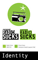
2. Strengthen the logo. I felt that my radio logo was too generic as it was from the poster project, so I made some changes to strengthen it. I added an X across the speaker to try to communicate that something was wrong with radio, that this logo represented an idea more complex than just being an image of a vintage radio. I think the idea I was going for was on the right track- but the X was not communicating that. I've been working finding another way to i
mbue the radio with more meaning and significance. I think I've settled on an image, you can see the changes I made in the image to the left. I think the hole in the radio communicates the idea that something is missing, that something is wrong, with radio. The hole is the focal point now, instead of the radio itself; so
 the message of the image has become what is wrong with radio, instead of merely depicting a cool, vintage radio. Please let me know what you think! Is it working? A little? Not at all? Does the hole really look like a hole? Or does it just look like a white circle slapped a radio? Let me know what you think.

Sunday, March 2, 2008

PSTR- Final Critique

So here's my final critique for my poster. Overall, I'm pretty happy with it. I think the text at the bottom is my favorite part, and that's probably because I'm usually very conservative in my use of type. The image is usually the focal point, with the text being secondary, but in this poster, the text itself acts acts the main images, with the other images being the secondary element. I think I also like this poster a lot because my style is usually very clean and simple, and for this poster I got to push away from that and create something more grungy and  exciting, which was fun for me. I do agree with the class feedback which said that it would be a more effective and attention-grabbing poster if it were scaled larger. When I revise the poster to be part of the Series, I'll definitely make it bigger.  I'll also be makign it even more grungy, I'm thinking about finding a font that looks like it's been screen or block printed- but it would have to be a really convincing typeface, I don't want it to look cheesy or fake. So I'm looking into maybe actually printing the letters and phrases I want somehow, and then scanning them. We'll see how that turns out.

Thursday, February 28, 2008

SRS- Ridiculous Song lyrics (Why mainstream radio sucks)


Sorry if some of these are super vulgar.... that's part the reason they suck.


Soulja Boy- Crank That

I'm Jocking On Yo Bitch Ass
And If We Get The Fightin
Then I'm Cocking On Your Bitch ass

Fergalicious- Fergie
Fergalicious definition make them boys go loco
They want my treasure so they get their pleasures from my photo
You can see me, you can't squeeze me
I ain't easy, I ain't sleazy
I got reasons why I tease 'em
Boys just come and go like seasons

Sexual Eruption- Snoop Dogg
I'm gonna take my time, she gon get hers before I get mine
I'm gonna take it slow (woah woah)
I'm not gonna rush the stroke
So she can get a sexual eruption

Avril Lavigne- Girlfriend
Don't pretend I think you know I'm damn precious
And hell yeah I'm the motherfucking princess

Webbie- Independent
She A Bad Lil Chick A Fly Lil Chick
Hit Me On My Phone She Like To Buy That Dick
Got Her Stunna Shades Lookin Like Something
Stallion Hair Long She A Nice Sumthing
She Like To Go To The Mall Everyday For A Outfit
Hair Did Nails Did Independent Wat She Call That

Pussycat Dolls- Buttons
I'm telling you loosen up my buttons baby
But you keep fronting
Saying what you going do to me
But I ain't seen nothing

Taylor Swift- Teardrops On My Guitar
He's the reason for the teardrops on my guitar
The only thing that keeps me wishing on a wishing star

Amy Winehouse- Rehab
I ain’t got the time
And if my daddy thinks im fine
He’s tried to make me go to rehab
I wont go, go, go.

Nickelback- Figure You Out
I like your pants around your feet
I like the dirt that's on your knees
And I like the way you still say please
While you're looking up at me

Mims- This Is Why I'm Hot
This is why I'm hot
I don't gotta rap
I can sell a million saying nothing on the track

Lil' Mama- Lipgloss
They say my lip gloss is cool
My lip gloss be poppin
Im standin at my locker
And all the boys keep stoppin

T-Pain- Buy You A Drank
Whats The Chance A You Rollin Wit Me
Back To The Crib
Show You How I Live
Lets Get Drunk Forget What We Did


Tuesday, February 26, 2008

SRS- Planning

Hi everyone- so here's an update on my series. I'm going to do a very take-it-to-the-streets campaign, nothing corporate feeling, everything very grunge. My media may include street posters, flyers, stickers, t-shirts, and/or a flash website. Even though a website seems more corporate, I would really like to do one, and it's going to be done in a very non-corporate style. And in today's world where anyone can blog and create websites, and because it's a such a good medium for mass-communication and organization, and the people I'm targeting are of the net generation, I don't think it will make my series too corporate. Some pics for inspiration will follow soon.

Thursday, February 21, 2008

SRS- Inspiration for style


I'm definately going to continue the general style that I started on my poster, but I think I'm going to exaggerate it more. When I started my poster Ange suggested that I play up a sort of 90s-grunge look (think Nirvana, flannel shirts, greasy hair... you children of the 90s know what I mean. :P) But I think it would be a very appropriate for a poster that's major tagline is "MAINSTREAM SUCKS". I really enjoy making flash websites, so one of the pieces in my series will definitely be that. I'm think of an animation intro to the website with a couple shocking facts about the big media takeover of radio, and then a grunge-like style for the rest of the site. Here's a screen shot of one website that was close to the type of style I think I'll go for.

SRS- Inspiration for Content


Hey everyone-

Here's some articles I'm going to look to for inspiration/information. Take a look!

Pay for play

Why does radio suck? Because most stations play only the songs the record companies pay them to. And things are going to get worse.
- - - - - - - - - - - -
By Eric Boehlert

March 14, 2001 | Does radio seem bad these days? Do all the hits sound the same, all the stars seem like cookie cutouts of one another?

It's because they do, and they are.

Why? Listeners may not realize it, but radio today is largely bought by the record companies. Most rock and Top 40 stations get paid to play the songs they spin by the companies that manufacture the records.

But it's not payola -- exactly. Here's how it works. Click to read the rest of this article.


Radio's big bully

A complete guide to Salon's reporting on Clear Channel, the most powerful -- and some would say pernicious -- force in the music industry.
- - - - - - - - - - - -
For the past few months, Salon reporter Eric Boehlert has been tracking the story of Clear Channel Communications, the little-noticed media giant that has quietly taken over the country's radio and concert industries.

The company owns nearly 1,200 radio stations and effectively controls the rock radio market. It also owns SFX Entertainment, the nation's dominant concert-venue owner and touring promoter.

In the stories below, Boehlert has detailed the corporation's evolution under the aegis of Randy Michaels, the one-time shock jock who has turned the industry upside down with rampant cost-cutting and a good-ol'-boy approach to management. Click here to read the rest of this article.

Tuesday, February 19, 2008

Website Is Up!

Yayyyy! My website for this class is up and running! The solution to the mystery of the non-working-STFP-uploader was solved by using Cyberduck, instead of Fugu or Fetch. Who knows why... computers are just crazy. But it works! So I don't really care why anymore. So here's my website, up and working!

Saturday, February 16, 2008

PSTR- Progress

Here's the evolution of my poster so far. I still have a lot of reworking to do with the images, so the picture on the left is NOT my final, but's it the current stage of progress I'm at. Right now I'm working on finding a balance between having the images be recognizable as people who represent why radio sucks, but keeping them toned-down enough so that they don't take the attention from the headline, which is the focal point of the poster. Ange pointed out that the poster doesn't direct your eye very well, your eye tends to get stuck up at the top, which I completely agree with. So I'm also trying to re-work the lines coming out of the radio so that they direct the eye better, instead of distracting. If anyone has any other ideas or constructive criticisms please feel free to tell me! Thanks!


Tuesday, February 12, 2008

Webspace Rant.

Wow this is so frustrating! I don't know if anyone else is having this same problem... but today in class I had NO problem using Fetch to upload things to my webspace, but when I go home and try to get to my webspace from fetch on my home computer, I get an error message EVERY TIME! "SFTP connection to "drotn008.email.umn.edu" could not be opened because the connection to the SFTP server could not be established or was lost". Huh?? So I guess I'll have to wait until I'm on a university computer in McNeal to try to put up a link to my blog. Boo :( Sorry Ange!

Sunday, February 3, 2008

PSTR- Sketches


PSTR- Initial Ideas

While looking at the list of "Things That Suck", I found the section on radio. It talks about how radio has become monotonous and brainless due to limited numbers of frequencies available and big media companies taking over huge numbers of stations. I did a speech on media consolidation with an emphasis on radio for my public speaking class last semester, so I know a fair amount of background on that issue. That speech also made me pretty interested in the issue and realize WHY all my favorite radio stations have disappeared in the last five or so years. For example, the time my favorite 80's, 90's and Today station mysteriously became a country station overnight to my dismay... booo Clear Channel Broadcasting... Boooo.

Wednesday, January 30, 2008

REV- Sketches & Critique

Initial Ideas:

For this book review presentation, I obviously wanted to include information like strengths, weaknesses and points of interest found in the book, but I also wanted to present it in a way the reflected the contents of the book. I chose to use light blue and red for my graphic elements because these two colors were prevalent throughout the book and would show up well in a projection. I chose to use a simple layout with solid color line elements, which also reflected the style of the book layout.


Personal Critique of Final:

I feel this presentation successfully reflects the style of "Graphic Design That Works". I feel that I could have gone more in depth with the information provided in the presentation. I found it difficult to create a simple, easy to read presentation without being too minimalistic, or to provide enough information without turning the presentation into a novel.