Wednesday, April 30, 2008

BLG- Final

 Hey everyone! As you can see, my blog looks a little different than the last time you visited!


I wanted the look of my blog to go with the look of my website, and that dots template just wasn't cutting it. So, through trial and error, I edited the html of the template so it would have a different background and slightly different set-up. I only have a vague knowledge of html, so there's no way I could have done this from scratch. But I knew enough to be able to identify the bits of the pre-made template that I wanted to change, move, or remove. It took me a couple hours, but I'm glad I did and I think that it turned out pretty well! Let me know what you think!

Tuesday, April 15, 2008

PYL- In Progress

Hey everyone. Welcome to part two of my blogging for our polymer plate printing project. Try saying THAT five times fast!


Since my last blog, I've narrowed my concept down to two options.
I found some good reference pictures for each concept online, so I put those into illustrator and then started working on the text. I went through so many versions of the text for each option. I must have tried a dozen type faces for each. But in both cases, I eventually went back to one of the first typefaces I tried. 

Option 1- A satire of the word "well-made", by using an image of the Lean Tower of Pisa. 
I ended up choosing Helvetica. I initially only tried this typeface as a placeholder until I chose another one, but it ended up sticking. During class today, Ange suggested using a more "italian" typeface that corresponded better with the image of the Leaning Tower. I agreed, and tried and tried to find one that would work, but none of the typefaces I tried out seemed to work as well as the original Helvetica. Either the X-height was too short, or they were fussy, or they didn't line up right, or I could find some other reason not to use them. None of the typefaces could compare to the POP that I feel the helvetica has. They all fading away instead of having the impact I wanted. So I stuck with Helvetica.

Option 2- Using text as image by showing the words being crushed under an anvil. 
I originally didn't have this concept in my top two, but while google-image surfing I found a really sweet image of a really old anvil, and the concept went from there. I wanted to create the illusion of three dimensions, so I made the text look like a cube. After experimenting with lots of typefaces, I went with Bauhaus because it looked the most solid, and "well-made", and it is historically from the same time period as the anvil itself. Perfect! 

Take a look and let me know what you think please! Por favor! S'il vous plait!

PYL- Concept

Hey y'all! So as my fellow classmates all know, right now we're in the process of creating, refining and doing the technical set-up for our polymer printing plates. We each get two 4x6 prints, and two colors for printing. We were also each given a pre-fix for the word "Made" (ie. man-made, pre-made, ready-made, ect.) Mine word is well-made. So let's take a look at what I've been working on!


So... I had two directions I was thinking of going with my concept. 

The first, satire of "Well-made". I tried to think of things that were obviously NOT well made, to create an amusing, sarcastic contrast with my word. I thought of the Leaning Tower of Pisa or the Titanic. Alyssa also suggested the Ford Pinto, that exploded if you got in a fender-bender. I really liked the idea of using satire because it would add an interesting and memorable twist.

The second direction was using text as image. I thought using text as image would be very effective in this project because the entire concept is based around a single word. I tried to think of ways that I could illustrate or exemplify the word in combination with the text. One idea was working the seven wonders of the world into the negative spaces of the text. Another was making the letters look like old stone sculpture with vines growing up them. Clearly ancient, but still standing. Several ideas revolved around showing the words themselves being attacked or under stress, but not being damaged. These ideas included a jack hammer on the letters, having the words crushed under an anvil, a dog biting at a letter, burn marks from an explosion, or two hands trying to break the words.

Sketches will follow soon.

Wednesday, April 9, 2008

SRS- Final

The Series piece is finally all done and turned it! That's a load off! Haha but I don't mean to make it sound like I didn't enjoy the project- because I did. A lot more than I thought I would too. I really enjoyed making a campaign, not just one piece that stands on it's own. I think that making series/campaigns is more applicable to the kind of work we'll all be doing after we graduate. I think it's doubtful we'll have many projects that are just ONE thing. For a concert you need posters, tshirts, tickets, advertisements... for ads, you might have magazine, newspaper, billboard... ect. When we get closer to graduating, we'll need business cards, a portfolio, website, ect. that all work cohesively together and communicate a strong, solid identity. So I think doing this project was really good practice for that.
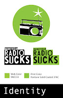
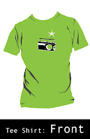
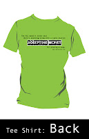
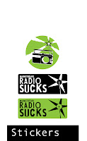
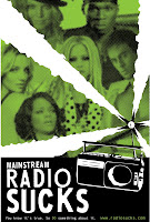
Now that I'm looking at my entire series together- the identity, poster, stickers, tshirt and website... I'm pretty proud of it! I'm glad we had so much time to do this project, because I know the result I turned out is exponentially better than if I'd had two less weeks, even if we hadn't had the Greenway project. I think all my pieces work well together, and they are a very cohesive campaign, without losing variety. 
My favorite piece is DEFINITELY the website. I've discovered that I really have a passion for Flash websites. If I knew Dreamweaver I might have  a passion for that too, but I can't seem to wrap my mind around that program. So I have no idea. But yeah, I think my series turned out very well, with the website being the strongest component. 
I think my series turned out as well as did because I got so into this assignment. That happened for two reasons: 1#- I was excited at the chance to do a whole campaign, instead of only one piece. 2#- Because I chose a topic that I'm really interested in, which made all the hours of work a hundred times more fun, which made my work a hundred times better!

Here's my website! The other pieces can be found there as well. Let me know what you think!

GRWY- The Whole Sha-bang.

Okay- so here's each piece of my blogging for the Greenway piece. Concept, Process and Final.
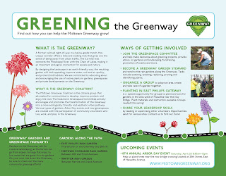

Concept: My other group members were Lisa and Alyssa. After some brainstorming we determined a couple important aspects of our Greenway piece. 
#1- It would be a mailer. 8.5 x 11'', folded in half, and sealed with a sticker. We focused the information primarily on volunteer opportunities, and even made a text blurb that could be incorporated with the Greenway logo as almost a sub-identity for Greenway volunteering programs. 
#2- We knew that Greenway didn't want the piece to feel too coroporate, so we decided some hand-done (but on the computer) illustrations of native plantlife would be a good way to make it less formal, or corporate. The illustrations would also emphasiz
e the ideas of spring and growth that we wanted to communicate in our piece.

Process: It was sort of difficult to get things done in an efficient, yet evenly divided up way with three group members all working on the same piece. So we decided to each take one side of the mailer. Lisa had the front, I had the inside, and Alyssa had the back. We each did on our piece mostly out of class, but we discussed styles and visual elements in class so that we would have a more cohesive piece. We received feedback on our design from Theresa at Greenway. She wanted more focus on the Arbor Day event, and less on the volunteering opportunity. So we spent the majority of one class and editing information and redoing our heirarchy, and I think it turned out really well. Lisa touched up the illustrations, and we made a few changes to make the three sides of the piece be even more cohesive. 
Final: So the project is all done and submitted to Theresa, and I'm pretty happy with what we turned out. I like how fun and friendly our piece felt, which I think is very important when the main goal is to get people personally involved with something. You don't want a design to intimidate them too much. I think the text on the inside that we re-worked after our rough draft turned out very well. And Lisa's illustrations were great. So all in all, I'm pretty happy with the piece that we turned out. Let's see how Greenway agrees with me!